



ドットの世界へ! 草間彌生の『クサマズ・ポップ』を振り返る
ドット、ドット、ドット……。赤、黄色、緑、青。大きな花に、カラフルな絵、家具、携帯電話。
草間彌生の作品と聞いて、赤や黄色の水玉模様を思い浮かべる人も多いのではないでしょうか。
私自身も、草間彌生といえば水玉模様というイメージを持っていました。しかし、実際に展示を見ていくと、目に留まるのは水玉模様だけではありません。作品のさまざまなところに草間彌生ならではの表現が広がり、見慣れたものも違った姿に見えてきます。
今回は、2026年4月16日から8月30日まで、東京都新宿区の草間彌生美術館で開催されていた展覧会『クサマズ・ポップ』を振り返ります。会場で見つけたものや、個人的に「これ面白い!」と思った作品を中心に紹介していきます。
Into the World of Dots! A Look Back at Yayoi Kusama’s “Kusama’s Pop”
Dots, dots, dots…
Red, yellow, green, blue.
Large flowers, colorful paintings, furniture, cell phones, and mirrors.
Many people probably think of “polka dots” first when they hear the name Yayoi Kusama, right?
I, too, when I see Yayoi Kusama’s work, think, “Of course, it’s polka dots!” However, as I actually viewed the exhibition, it gradually became more than just “polka dots.”
“Wait, even here?”
Yayoi Kusama’s world extended to places that made me think just that.
This time, we’ll look back at the exhibition “Kusama’s Pop,” which was held at the Yayoi Kusama Museum in Shinjuku-ku, Tokyo, from April 16 to August 30, 2026. We’ll introduce things I found at the venue and works that I personally thought were interesting!
草間彌生とは? ポップカルチャーにもつながる表現 | Who is Kusama Yayoi?
草間彌生は、1929年に長野県松本市に生まれた前衛芸術家です。水玉や網目の反復、鮮やかな色彩を用いた絵画や彫刻、空間全体を使ったインスタレーションなど、独自の表現を追求してきました。
草間彌生の作品を思い浮かべたとき、まず水玉模様をイメージする人も多いのではないでしょうか。その特徴的なモチーフは、絵画の中だけにとどまりません。家具や携帯電話、日常的なものを取り入れた作品にも広がっています。こうした、ひと目で作家を連想させるビジュアルや、アートと日常の境界を越えていく表現も、草間彌生の作品に注目したい理由のひとつです。
ポップカルチャーという視点から見ると、草間彌生の作品には、デザインやイラストにも通じる面白さがあります。印象に残る色や形、繰り返されるモチーフ、そして日常のものを新鮮に見せる工夫。これらは、私たちが普段目にする広告やファッション、プロダクトのビジュアルを考えるうえでも興味深いポイントです。
今回は『クサマズ・ポップ』を振り返りながら、作品の中に見つけたデザインやポップカルチャーとの接点を紹介します。なお、草間彌生さんが2026年8月14日に逝去したことが、同月27日に公表されました。長年にわたって独自の表現を追求してきた草間さんの作品を、改めて振り返ってみたいと思います。
Who is Yayoi Kusama? Her Expression Connects to Pop Culture
Yayoi Kusama is an avant-garde artist born in Matsumoto City, Nagano Prefecture in 1929. She has pursued a unique form of expression through paintings and sculptures using polka dots, repetitive patterns, and vibrant colors, as well as installations that utilize entire spaces.
When thinking of Yayoi Kusama’s work, many people probably first picture polka dots. This distinctive motif isn’t limited to paintings; it extends to works incorporating furniture, mobile phones, and everyday objects. These visuals, which instantly evoke the artist, and expressions that transcend the boundaries between art and everyday life, are some of the reasons why Yayoi Kusama’s work deserves attention.
From a pop culture perspective, Yayoi Kusama’s work has an appeal that resonates with design and illustration. Memorable colors and shapes, recurring motifs, and ingenuity in making everyday objects appear fresh—these are interesting points to consider when thinking about the visuals of advertisements, fashion, and products we see every day.
This time, we’ll look back at “Kusama’s Pop” and introduce the connections to design and pop culture we found within her work. Incidentally, Yayoi Kusama’s passing was announced in August 2026. We’d like to take this opportunity to revisit the works of Kusama, who pursued her unique form of expression over many years.
会場の美術館はどこにありますか? | Where is the museum located?
所在地:東京都新宿区弁天町107番地
会場である「草間彌生美術館」の最寄り駅は都営大江戸線牛込柳町駅で、東口から徒歩約6分です。早稲田駅(徒歩約7分)または神楽坂駅(徒歩約9分)からもアクセス可能です。
本展は会期を終了しています。現在開催中の展覧会のチケット情報は、草間彌生美術館の公式サイトをご確認ください。
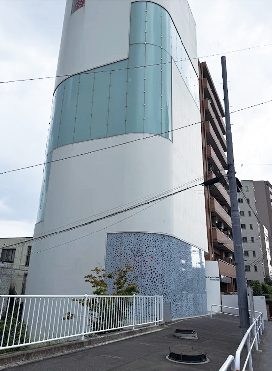
美術館を外から見た景色 | View of the museum from outside
Location: 107 Bentencho, Shinjuku-ku Tokyo 162-0851.
The closest station is the Ushigome-Yanagicho Station on the Toei Oedo Line which will take about a 6 minute walk from the East Exit. You can also reach the museum from Waseda Station (about 7 minutes walk) or Kagurazaka Station (about 9 minute walk).
This exhibition have already finish but you can buy the tickets for the new exhibitions.
自動販売機まで草間彌生に!? | Even the vending machines?!
展示を見ていて、最初に「これは面白い!」と思ったもののひとつがこちら。
街中で見かける自動販売機が、赤と白の水玉模様に覆われています。こちらは、草間彌生の作品《Prototype for Dots on Vending Machines》(2001)。
飲み物を買うための身近な存在である自動販売機も、草間彌生のトレードマークともいえる水玉模様が加わることで、見慣れた風景から少し離れた、不思議な存在に見えてきます。
日常の中にあるものが、表現ひとつで違った姿を見せる。そんな変化を楽しめる作品でした。
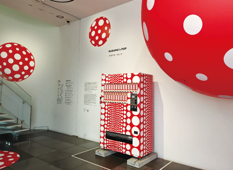
水玉の自動販売機 | Red and White Dots on Vending Machines
One of the first things that caught my eye while viewing the exhibition was this:
Take this vending machine for example.
AAt first glance, it looks like an ordinary vending machine. But if you look closely, you’ll see red and white polka dots. This is “Prototype for Dots on Vending Machines” (2001). A vending machine, something we usually see around town, has been transformed into a work by Yayoi Kusama.
We don’t usually pay much attention to vending machines, do we? We tend to think of them more as “places to buy drinks”.Yayoi Kusama’s work is instantly recognizable when it’s covered in polka dots like this.
水玉、階段にもいる!| There’s dots on the stairs too!
さらに進んでいくと、今度は階段にも水玉が。
展示室の中だけではなく、建物の中にも水玉が広がっています。《Dots Obsession》は美術館の中に広がる形で展示されていて、作品そのものだけではなく、空間まで一緒に見ているような感覚がありました。
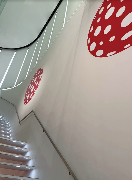
ドット・オブセッション | Dots Obsession
I personally found it fascinating how “ordinary things look completely different when they enter Yayoi Kusama’s world.”
Polka dots, even on the stairs! Further on, there were polka dots on the stairs too. I thought, “They’re here too?!” Polka dots were spread not only within the exhibition rooms, but throughout the building.
《Dots Obsession》 was displayed in a way that it spread throughout the museum, giving me the feeling that I was seeing not only the artwork itself, but the space as well. It was almost as if the museum itself was being gradually taken over by Yayoi Kusama…
カラフルな絵の前で、目が忙しい! | So many colours, so much to look at!
そして、展示を進んでいくと、カラフルな絵が一気に目に入ってきます。赤、青、黄色、緑。太い線。繰り返される形。たくさんの色と形が並んでいるので、どこから見ればいいのか少し迷ってしまうくらいです。一つの作品を見ていたはずなのに、隣の作品の色が気になって、またその隣を見て……。気づいたら、目がずっと動いていました。
草間彌生の作品は、シンプルな形や線が使われていても、色や配置、繰り返しによって全体の印象が大きく変わります。個人的には、こういうところを見ると「グラフィックデザインの作品を見る感覚に少し似ているかも」と思いました。色の組み合わせや形の反復、画面全体の構成。作品を楽しみながら、デザインの視点からもいろいろと考えたくなる展示でした。
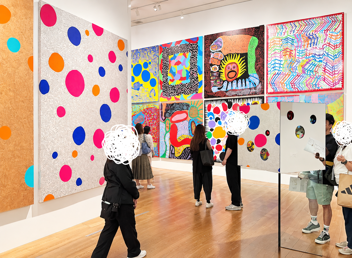
I looked at the artwork and moved on to the next room. Even the staircase along the way had something that looked like part of the artwork. At this point, it becomes difficult to distinguish between the “exhibition” and the “building”. It’s almost as if the museum itself is being gradually taken over by Yayoi Kusama…
My eyes are busy in front of the colourful paintings!
As I continued through the exhibition, a flood of colourful paintings immediately caught my eye. Red, blue, yellow, green. Thick lines. Repeating shapes. There were so many colours and shapes lined up that I was a little overwhelmed and didn’t know where to start. I was supposed to be looking at one piece, but then the colours of the next piece caught my attention, and I looked at the one next to that… Before I knew it, my eyes were constantly moving.
Even though Yayoi Kusama’s works use simple shapes and lines, the overall impression changes dramatically depending on the colours, arrangement, and repetition. Personally, I thought that this was somewhat similar to the feeling of looking at graphic design artwork. The combination of colours, the repetition of shapes, the overall composition of the screen. It was an exhibition that made me want to think about various things from a design perspective while enjoying the artwork.
チューブ? | Tubes?
次に目に入ってきたのがこちらです。
大きなチューブのようなオブジェが、鏡のある空間いっぱいに広がっています。
近くで見るとかなり大きいのですが、鏡に映ることで、さらに奥へ奥へと続いているように見えてきます。
『これ、どこまで続いているんだろう?』実際の空間と鏡に映った空間の境目が分からなくなり、ちょっと不思議な感覚になりました。
写真で見るとかなりインパクトがありますが、実際にその前に立つと、作品の大きさや鏡による見え方の変化も含めて楽しめる展示でした。
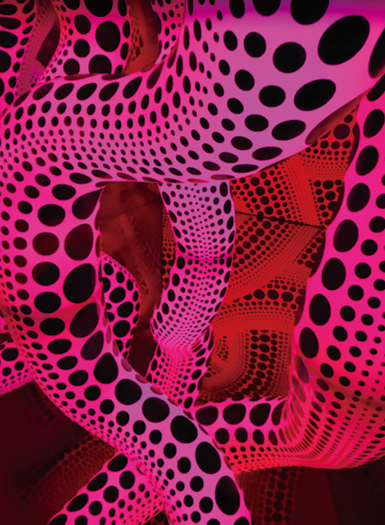
インフレータブルルーム | Inflatable room
Next, this caught my eye.
A large, tube-like object stretches across the entire mirrored space. Up close, it’s quite large, but reflected in the mirror, it appears to extend even further into the distance. The objects were already huge when I stood in front of them, but their reflections seemed to carry them farther and farther into the distance.
At one point, I caught myself thinking, “Wait… where does the actual room end?”. The installation looks incredibly striking in photos, but standing in front of it was a different experience. Including the scale and the changing reflections made the whole space feel strangely immersive to me.
“How far does this go?” The boundary between the actual space and the space reflected in the mirror becomes blurred, creating a somewhat strange feeling. While it’s quite impactful in photographs, standing in front of it in person allows you to enjoy the exhibition, including the size of the artwork and how it changes in appearance due to the mirror.
鏡の中にも、また水玉!| The dots keeps going
今回、個人的に印象に残ったのがこちら。カラフルなモチーフが配置された小さな鏡の部屋です。鏡に映ることで、実際の空間よりもずっと広く見えます。正面を見ても、横を見ても、鏡の中に同じ空間が続いているように見えて、「これ、どこまで続いているんだろう?」と思ってしまいます。
実際には小さな部屋なのに、鏡の中ではどこまでも広がっているように感じる。
ただ作品を見るだけではなく、自分自身もその空間の中に入り込んでいるような感覚がありました。写真だけでは、この「実際にその場に立った感じ」はなかなか伝わらないかもしれません。こういう作品は、やっぱり実際に体験してみたくなりますね。
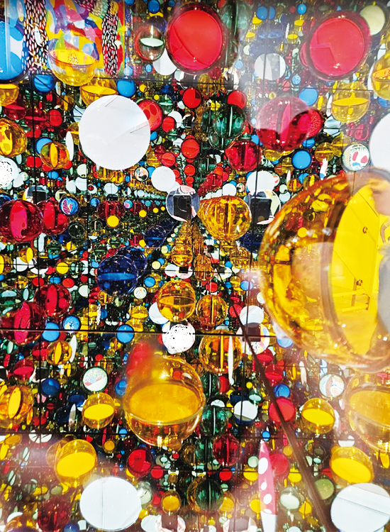
カラフルな鏡の部屋 | Colourful mirror room
This is what personally left the biggest impression on me this time. It’s a small room filled with mirrors and colourful motifs. The reflection in the mirrors makes the space appear much larger than it actually is.
Whether you look straight ahead or to the side, the same space seems to continue within the mirrors, making you wonder, “How far does this go?”.
Even though it’s actually a small room, it feels like it stretches on endlessly within the mirrors. It wasn’t just about looking at the artwork; I felt like I was actually immersed in that space.
Photographs alone might not fully convey this “feeling of actually being there.” Works like this really make you want to experience them in person.
草間彌生の世界に住んだら? | What if Kusama Designed your living room?
展示の中には、絵画や彫刻だけではなく、家具もありました。この作品は《黄樹リビングルーム》(2002)。
本作は、「生活風景に溶け込む草間作品」を基本コンセプトとし、草間彌生と大阪を拠点とするデザイン集団「graf」とのコラボレーションによって2002年に制作された家具シリーズ、およびそれを用いたインスタレーション作品です。空間を構成するソファ、照明、テーブルなどの家具、ならびに周囲の壁面は、草間彌生が1990年代から描き続けている代表的な絵画モチーフである「黄樹(Yellow Tree)」と、彼女の代名詞である「水玉(ポルカドット)」のオリジナルファブリックによって全面的に覆い尽くされています。(引用元:graf公式ステートメントより)
普通の部屋に置いたら、かなり存在感がありそうですよね。というより、絶対に見逃せない。家具は本来、座ったり、物を置いたりするために使うものです。でも、ここでは家具そのものが展示作品になっています。「もし草間彌生さんが部屋をデザインしたら、こんな感じになるのかな?」
なんて想像しながら見るのも楽しかったです。アート作品として鑑賞するだけでなく、インテリアデザインの視点から見ても面白い作品でした。
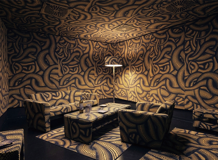
YELLOW TREE Living Room(2002)
The exhibition included not only paintings and sculptures, but also furniture.
This is “YELLOW TREE Living Room” (2002). It’s a living room typical of Yayoi Kusama, with yellow furniture featuring distinctive patterns.
If this were placed in an ordinary room, it would certainly have a strong presence. In fact, it’s something you absolutely can’t miss. Furniture is originally meant to be “sat on” and “used.” But here, the furniture itself is the exhibited artwork.
“What if Yayoi Kusama designed a room? Would it look something like this?”. It was fun to imagine that while viewing it.
It was an interesting piece not only to appreciate as an art piece, but also from an interior design perspective.
携帯電話まで? | Until the phone?
そして、私たちの生活には欠かせない携帯電話の作品も展示されていました。こちらは、KDDIの『iida』から展開された『Art Editions YAYOI KUSAMA』のプロジェクトで制作された3点の作品です。KDDIが2009年4月に発表した新ブランド「iida」における特別プロジェクトであり、単なる「デザイン家電」の枠を超え、「携帯電話を現代アート作品そのものに変貌させる」という挑戦的な試みでした。
KDDIの「iida」Art Editionsとは
現代アーティストと共に携帯電話を現代アートへ変貌させるプロジェクトであり、永続的な価値とアート・人生の素晴らしさを共有する場を創出することを目指しました。(引用元:KDDI公式ニュースリリース(2009年4月7日)別紙)
無限に広がるドットの世界《ドッツ・オブセッション、水玉で幸福いっぱい》(2009)(写真:左)
携帯電話と箱型の置き台がセットとなった作品。
赤地に白のドットで埋め尽くされた不可思議な箱、その側面から伸びるスコープから箱の中を覗き込むと、無限に広がるドットの渦。箱の中には、ドットと突起に埋め尽くされた携帯電話が入っています。
草間彌生氏が単身渡米し、ジェンダーや反戦など社会へのメッセージを色濃く反映した作品を多く手がけていた時代の作品「Infinity Mirror Room-‘Phalli’s Field」(1965年) の世界を見事に再現。
エディションNOと草間氏による直筆サイン入り。
携帯電話をハンドバッグに仕立てた草間氏による新しい提案《宇宙へ行くときのハンドバッグ》(2009)(写真:中央)
カラーと形からくる可愛らしさとドットの力強さが融合した今までにない佇まいの作品。シルクスクリーン作品「Handbag」(1985年) を鮮やかに再現。
ハッピーなカラーと鮮やかなドットを身にまとった、愛くるしい犬のオブジェ作品《私の犬のリンリン 》(2009)(写真:右)
3点のうち、私が特に注目したのは、《私の犬のリンリン 》(2009)という、携帯電話と犬の形をしたケースを組み合わせた作品です。
しかも、携帯電話というかなり身近なものなのに、ちゃんと「草間彌生の作品」に見える。色や形、模様の組み合わせを見ただけで、「これ、草間彌生だ!」と分かるのって、よく考えるとすごいですよね。
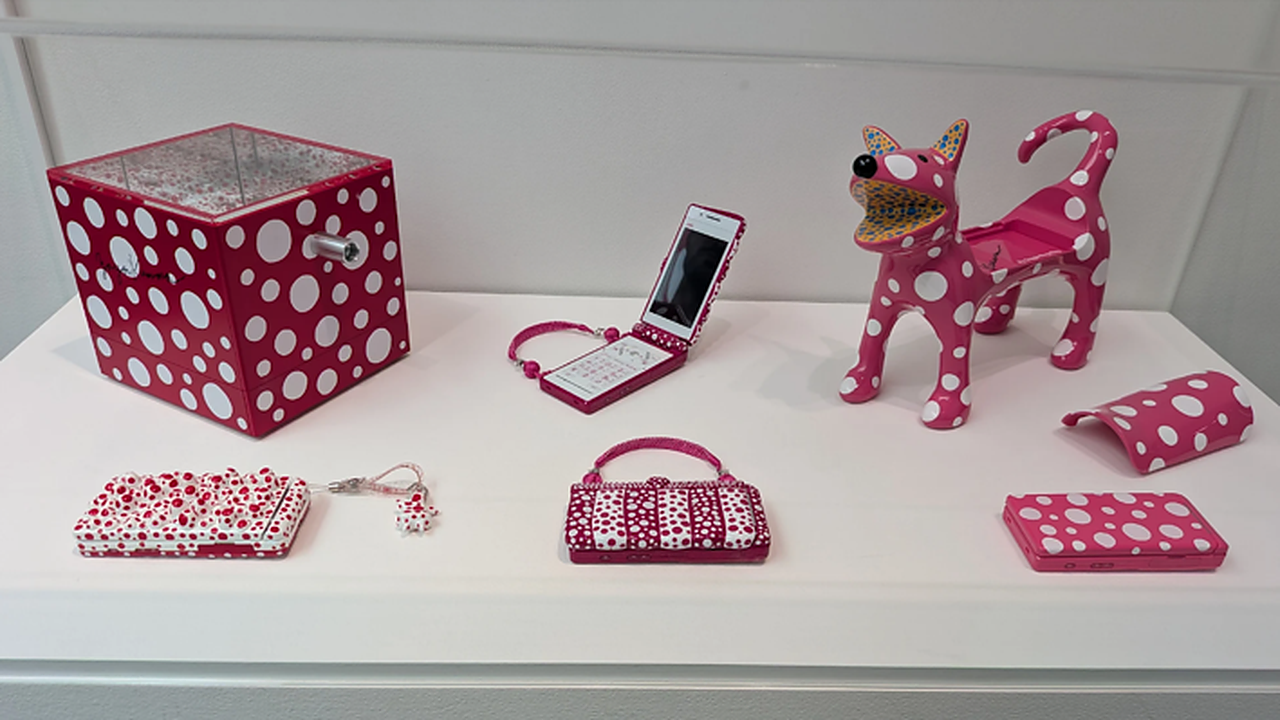
ドッツ・オブセッション、水玉で幸福いっぱい(2009)(写真:左)、宇宙へ行くときのハンドバッグ(2009)(写真:中央)、私の犬のリンリン (2009)(写真:右)
And then there was this:
It’s a piece called “My Doggie Ring-Ring” (2009), a combination of a cell phone and a dog-shaped case.
After seeing large paintings and sculptures, finding a small piece like this is a fun little discovery.
What’s more, even though it’s something as familiar as a cell phone, it clearly looks like a “Yayoi Kusama work.” It’s amazing when you think about it, that you can tell it’s a Yayoi Kusama piece just by looking at the combination of colors, shapes, and patterns.
It was an interesting piece not only as an art piece, but also from a product design perspective.
大きな花が登場! | Giant Flower!
そして、こちらは大きな花の彫刻。《明日咲く花》(2016)です。
鮮やかな色彩に彩られた花びらと葉に、繰り返し水玉と網目模様が描かれた大型の彫刻《明日咲く花》は、のどかな田園の中に超現実的な風景をつくりだす。花や植物は、種苗業を営む旧家に生まれた草間にとって、幼い頃から常に身近で、主要なモチーフであり続けている。草間がスケッチブックに描いたアイディアを大きく具現化した本作は、作家の幼い頃からの幻覚のヴィジョンを、陽気に横溢する生命力とともに映し出します。(引用元:100年後芸術祭ホームページ)
黄色い花びらに模様が入り、中央部分もカラフル。下から伸びる部分まで含めて、なんだか現実には存在しない植物のようです。
ここまで絵画や家具、小さなプロダクトなどを見てきたあとに大きな立体作品を見ると、また違った印象があります。平面の中で使われていた色や形が、今度は立体になって目の前に現れる。
同じアーティストの作品でも、素材や大きさが変わるだけで見え方がかなり変わるんだな、と感じました。日常の中にも広がる、草間彌生の世界。
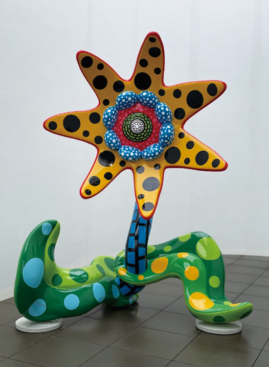
明日咲く花 (2016)| Flower that blooms tomorrow()
And here’s a large flower sculpture: “Flowers That Bloom Tomorrow” (2016).
The yellow petals are patterned, and the center is also colorful. Including the parts extending from the bottom, it somehow looks like a plant that doesn’t exist in reality.
After seeing paintings, furniture, and small products, seeing a large three-dimensional work gives a completely different impression. The colors and shapes used in two-dimensional works now appear before your eyes in three dimensions.
I realized that even with the same artist’s work, the way it looks changes considerably just by changing the material and size. Yayoi Kusama’s world unfolds even in everyday life.
草間彌生といえば水玉。そんなイメージから見始めた『クサマズ・ポップ』でしたが、実際に作品をたどっていくと、絵画だけではなく、家具や携帯電話、空間そのものにまで、草間彌生らしい表現が広がっていました。
普段何気なく目にしているものも、色や形、模様の組み合わせによって、まったく違う存在に見えてくる。そんな発見ができるのも、草間彌生の作品に触れる面白さなのかもしれません。
水玉というおなじみのモチーフを入り口に、日常の風景まで違って見えてくる。今回の展覧会を通して、草間彌生の表現の幅広さと、身近なものを新鮮に見せる力を改めて感じました。
草間彌生が追求してきた独自の表現は、これからも作品を通して、多くの人に受け継がれていくことでしょう。
When you think of Yayoi Kusama, you think of polka dots. That was the image I had when I started looking at “Kusama’s Pop,” but as I explored her work, I discovered that her unique expression extended beyond paintings to furniture, mobile phones, and even the very space itself.
Even everyday objects can appear completely different depending on the combination of colors, shapes, and patterns. Perhaps this kind of discovery is part of the appeal of experiencing Yayoi Kusama’s work.
Yayoi Kusama’s unique expression, which she has pursued, will continue to be seen by many people through her works.
Why not take a peek into the vast world hidden beneath the familiar motif of polka dots?
展覧会情報クサマズ・ポップ会場:草間彌生美術館会期:2026年4月16日〜8月30日※本展は会期を終了しています。
Exhibition info: Kusama’s Pop
Venue: Yayoi Kusama Museum
Dates: April 16, 2026 – August 30, 2026
*This exhibition has ended.
取材/PicoN!編集部 ダリシュ
↓PicoN!アプリインストールはこちら


関連記事

ミッフィーってすごい?―ディック・ブルーナのグラフィ...

デザイン深化論──携帯電話から生まれたエモーションの...
阿久根焼酎の復活に一役。鹿児島酒造株式会社「あくね...
【展示内覧会レポ】「庭」の思想を体現、10/4~大型写...
恵比寿&代官山エリアで気軽にアート巡り
【デザインの枠が広がる】展示レポート「もじ イメージ...
PicoN!な読書案内 vol.8 ― 『天才の思考 高畑勲と...
今注目の屋外型アートT3 PHOTO FESTIVAL TOKYOに行って...

制作のヒントがここに!-クリエイティブを学ぶ学生にオ...